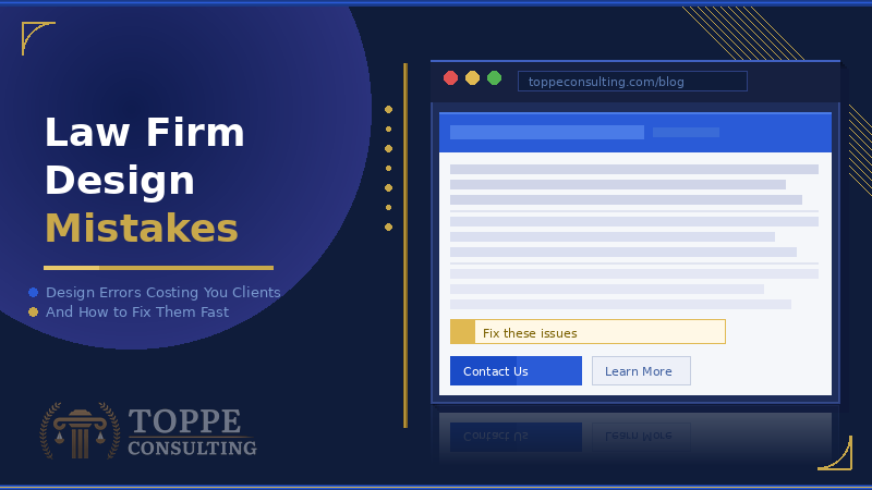
Law Firm Website Design Mistakes Attorneys Make
Law firm design mistakes drive potential clients away from your website before you speak a single word to them. Most attorneys never realize the damage exists until a competitor with a cleaner, faster, and more credible site captures the business that should have been theirs. The loss accumulates quietly — invisible in your analytics but visible in your empty consultation calendar. Understanding exactly which design decisions cost you clients is the essential starting point for any firm serious about competing online in 2026. If you have already read about the broader Law Firm Website Errors That Cost You Clients, this post goes deeper into the design layer where most firms lose the battle silently.
Law Firm Design Mistakes Begin Before the Page Loads
First impressions in digital environments form in under 50 milliseconds. That judgment happens before a visitor reads a single word of your content. Visual weight, color contrast, and layout structure communicate credibility — or its absence — almost instantly. A cluttered header, mismatched fonts, or a dated color palette signals to every prospect that your firm lacks attention to detail. That impression transfers directly to how they evaluate your legal judgment before they ever call.
Clean design is not a cosmetic preference. It is a credibility signal that directly influences whether a visitor stays or leaves. Firms that invest in professional, structured design convert visitors at dramatically higher rates than firms that treat design as an afterthought. A professional law firm website development partner must understand that every design decision is a marketing decision, not an aesthetic one.
The bottom line: Design is your first argument. Make sure it wins.
Mistake 1 — Too Much Information Above the Fold
The area a visitor sees without scrolling has to accomplish one job: communicate who you help and why you are the right choice. Attorneys frequently load this space with logos, rotating sliders, taglines, and three competing calls to action that say nothing specific to the visitor’s situation. A visitor who cannot determine within three seconds whether your firm handles their type of case moves on immediately.
Rotating image sliders are one of the most persistent law firm design mistakes in legal marketing. Research consistently shows sliders reduce conversions because visitors cannot process multiple competing messages simultaneously. A single clear headline paired with a direct call to action outperforms a slider on every measurable metric. Your homepage hero section must answer one question above all others — can this firm help me with my specific problem right now?
Simplicity converts. Every element competing for attention above the fold reduces the likelihood that a visitor takes the one action you actually want them to take. Stripping that space down to your value proposition and a single clear next step is not a design compromise. It is the correct strategic decision.
The bottom line: Replace your slider with one clear headline and one clear action. Conversions follow clarity.
Mistake 2 — Navigation That Confuses Instead of Guides
Navigation is a conversion tool, not a filing system. Attorneys frequently organize navigation around their firm’s internal structure rather than around what a prospective client actually needs to find. Visitors encounter menu labels like “Our Attorneys,” “Case Results,” and “Community Involvement” before they locate the practice area relevant to their specific situation.
A prospective client in a legal emergency does not want to explore your firm. They want to confirm you handle their case type and then contact you immediately. Practice areas must appear prominently in your primary navigation. Contact options must reach the visitor without clicking through multiple menu levels. Every navigation decision must be evaluated from the visitor’s perspective — not the firm’s internal org chart.
Here is a test I use when auditing law firm sites at Toppe Consulting. Hand your phone to someone unfamiliar with your firm and ask them to find your contact page starting from your homepage. Watch where their thumb hesitates. Wherever they pause is exactly where you are losing clients right now. It is the most honest 60 seconds of feedback you can get on your site, and it costs nothing.
The bottom line: Audit your navigation as a first-time visitor with an urgent problem. If the path to contact is unclear, it is costing you clients today.
Law Firm Design Mistakes That Destroy Trust
Trust is the single most important asset a law firm website must build. Prospective clients hand attorneys the most difficult problems of their lives, and they evaluate trustworthiness within seconds based purely on what they see. Certain design decisions destroy trust immediately regardless of how strong your actual reputation is in your market.
Stock photography of generic courtrooms and anonymous handshakes communicates inauthenticity instantly. Visitors recognize staged imagery because they have seen identical photos on dozens of competitor sites — sometimes the exact same photo. Real photography of your actual attorneys, your real office, and your genuine team builds the credibility that stock photos never replicate. Professional photography is one of the highest-return design investments available to any law firm at any budget level.
Missing or underdeveloped social proof destroys confidence at the exact moment a visitor decides whether to call. Testimonials, case results where ethically permissible under your state bar rules, and visible professional credentials must appear throughout the site — not buried on a single page. According to the American Bar Association, authentic client feedback presented within state bar guidelines significantly influences prospective client decisions. A site that looks and feels trustworthy converts at rates a site built without this consideration simply cannot match.
The bottom line: Real photos. Real credentials. Real results where permitted. These three elements build the trust that fills your consultation calendar.
Mistake 3 — Colors and Typography Working Against You
Color psychology directly influences conversion behavior on every page of your site. Law firms operating in high-stakes practice areas — criminal defense, personal injury, family law — benefit from palettes that communicate authority, stability, and calm confidence. Trendy color choices that work well in retail or hospitality frequently undermine credibility in legal contexts. Your color palette must be chosen for the emotional response it produces in a prospective client facing a serious problem, not for what impressed in a design portfolio.
Typography communicates professionalism before a visitor reads a single word. Inconsistent font pairings, body text set too small for mobile reading, and decorative fonts in professional contexts all signal a lack of attention to detail. Professional legal websites use clean, readable typefaces set at appropriate sizes across every device. Line spacing and paragraph length directly affect how long visitors stay engaged — and engaged visitors are the ones who call.
The bottom line: Choose your colors and typefaces for your client’s emotional state, not for what impresses in a design meeting.
Mistake 4 — Contact Forms That Create Friction
Contact forms are the final conversion mechanism on any law firm website. Forms that ask too many questions, display poorly on mobile, or fail to communicate what happens after submission lose prospects at the exact moment they reached out. Your contact form must be short, simple, and confidence-building at the same time.
Three fields convert best — name, phone number, and a brief description of their situation. Anything beyond that creates friction that costs real consultations. A clear confirmation message after submission must assure the prospect that a real person responds promptly and personally. The Upstate firms we have audited that streamlined their intake at the form level consistently see measurable increases in consultation bookings within the first 30 days. Every friction point in your contact process is also covered in Law Firm Website Conversion Rate Optimization.
Strong law firm digital marketing solutions treat the contact form as a conversion asset, not an afterthought bolted onto the bottom of a page.
The bottom line: Three fields. One confirmation message. One promise of a fast, personal response. That is a contact form that converts.
How to Audit and Fix Law Firm Design Mistakes for Good
Correcting law firm design mistakes does not always require a complete rebuild. Targeted improvements to navigation, photography, typography, and contact forms frequently produce dramatic conversion gains without touching the underlying site structure. The first step is an honest assessment of exactly where your current design is failing visitors. Approaching that assessment with the same rigor you bring to a legal matter separates firms that grow from firms that plateau.
A full site audit reveals every design weakness systematically. How to Audit Your Law Firm Website walks through that process step by step so no problem goes undetected. Strong law firm content writing working inside a well-designed framework ensures that every page earns its place in your client acquisition system.
The bottom line: You cannot fix what you have not honestly assessed. Start with the audit — then fix what the data reveals.
The Bottom Line on Law Firm Design Mistakes
Your website design is either building trust or destroying it. There is no neutral ground in 2026. Every law firm design mistake left unaddressed hands a silent advantage to the firm down the street. Attorneys who treat their website as a living client acquisition tool consistently outperform those who do not. Correcting these design errors is not optional for any firm serious about growth.
None of these fixes require guesswork. Every mistake in this post has a clear, actionable solution. One question remains — does your firm address them now or later? Another prospect is landing on your site right now. They decide in 50 milliseconds whether to call you or a competitor. Firms that act today build compounding advantages that become increasingly difficult to close. Start with a single honest look at what your design actually communicates right now.
Contact Us Today to Get Started
About the Author
Jim Toppe is the founder of Toppe Consulting, a digital marketing agency specializing in law firms. He holds a Master of Science in Management from Clemson University and teaches Business Law and Marketing at Greenville Technical College. Jim also serves as publisher and editor for South Carolina Manufacturing, a digital magazine. His unique background combines legal knowledge with digital marketing expertise to help attorneys grow their practices through compliant, results-driven strategies.
Recent Industry News

Law Firm Trends 2026: Record Profits Are Hiding Two Serious Threats

Why Workers’ Compensation Attorneys Can’t Afford to Rely on Traditional PR Anymore

The Saddest Attorney in Town Doesn’t Even Know He’s Famous (Only to His Mother

The Workers’ Compensation Attorneys Who Disappear